Unexpected Colors for Fall 2015

We're nodding yes to this year's fall color variations. This season's color palette emphasizes confidence as it plays up typical fall color schemes. Staying true to autumn's earthy tones, we are seeing fun and lively color statements pop up that add a certain boldness to the mix. If you can't seem to shake off the summer energy, don't fret, the vibrancy is transitioning into fall with colors like reflecting pond (deep blue), canary yellow, and cadmium orange.
Another definitive point of fall's pantone is the interchangeable hues of feminine and masculine. This is one of the first palettes to be completely unisex - notable in both the fashion and interior design industries. Designers agreed with the versatile pantone of the season, as we are seeing these colors from runway to photoshoot.
Marsala, the color of the year, is most definitely an expectation with the fall season - its rich and sultry look adds class and seduction to an outfit or room.
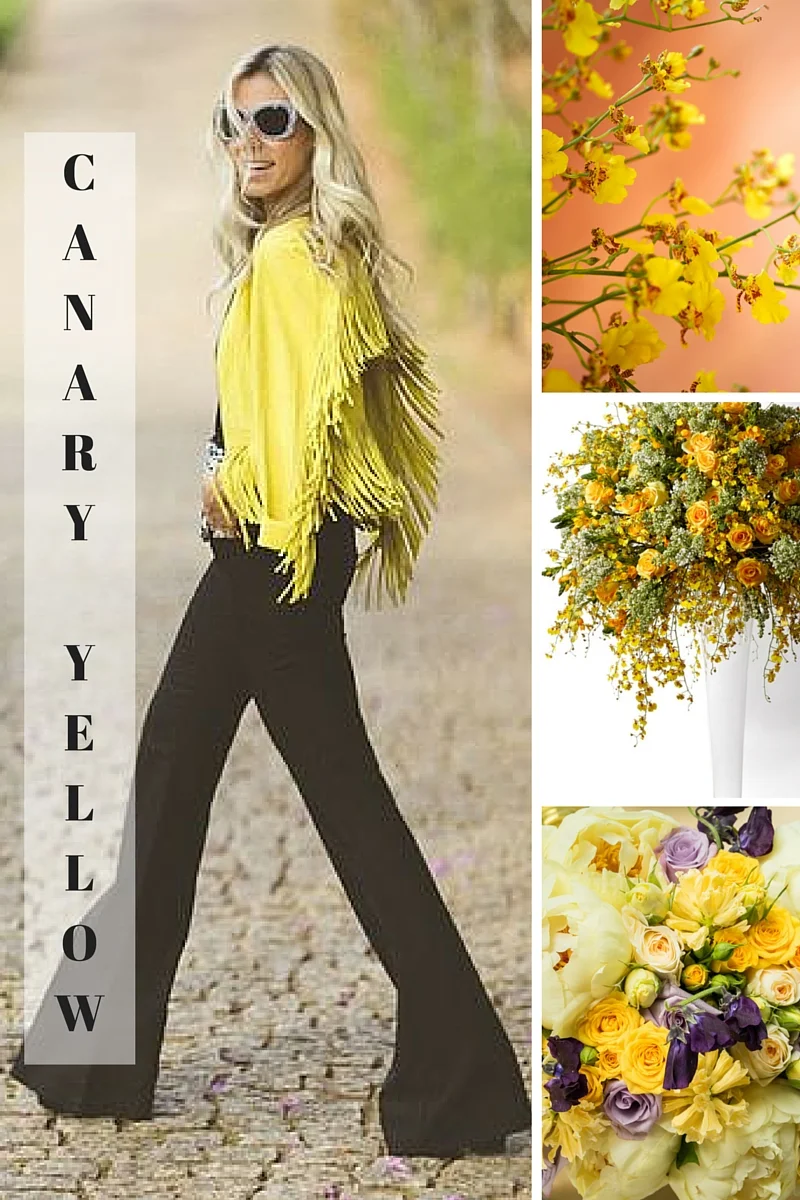
Canary yellow chirped in this season - the loud color pop gives life to the transition from summer heat to a wintery chill.
Source Image ( fur coat ) ( suit )
Reflecting Pond, a gorgeous deep sea color, adds sensuality to your typical navy. This hue can be used as an accent for a room or a statement in your wardrobe.
Source Image ( hair color ) ( sweater )
When we think cashmere rose - we think textured blush, a velvety softness, literally cheek to rose petal. Consider adding some fresh blooms in this color to a bedside table to soften the room.
Image Source ( silk organza ) ( home decor ) ( wooden door )
Amethyst Orchid, an excellent variation of last year's color of the year (Radiant Orchid), is romantic and sophisticated. This hue adds a cool warmth to a room, while maintaining a regal atmosphere.
Image Source ( balloons ) ( makeup ) ( interior )
A vibrant melon hue, Cadmium Orange, is playful and flirty. It's light and muted, which makes it easily transitional from summer accents to harvest statements, and even can be used as a cheery color in the dead of winter.


